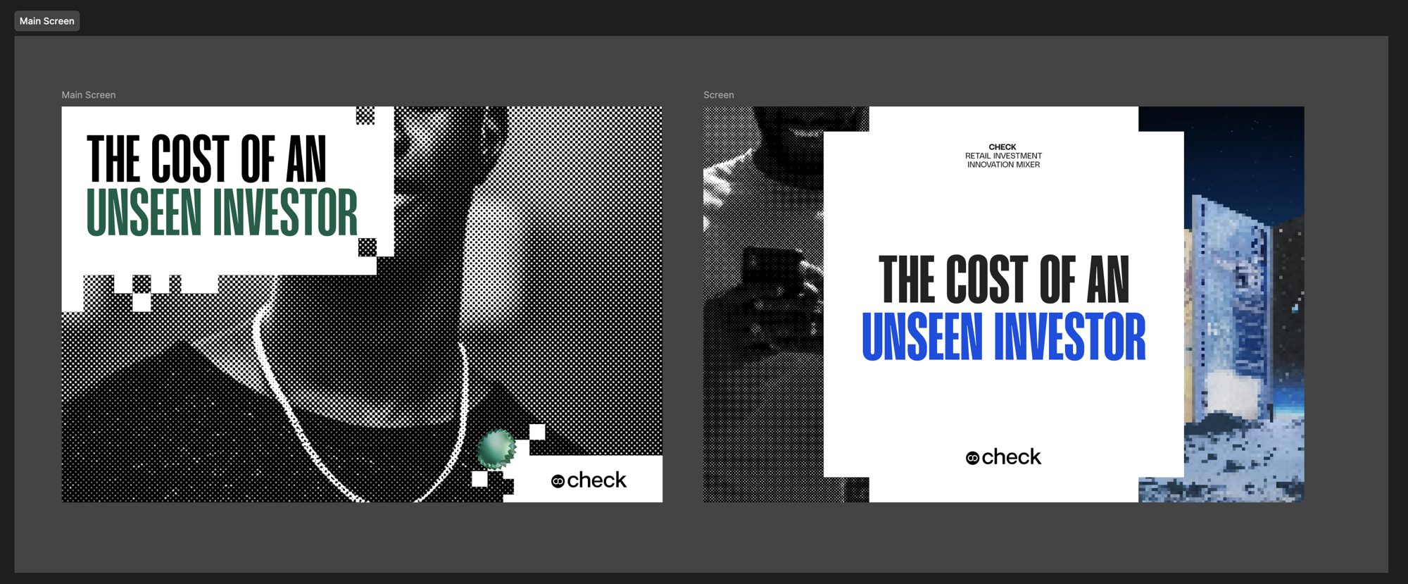
In August we hosted the Check Retail Investment Innovation Mixer, an evening with leaders from Nigeria's capital market to preview our 2026 retail investment report. The report is about the people the industry builds for, and its title says it plainly: The Cost of an Unseen Investor. My job, with the design team at Check, was to give that idea a room.
Most of my work is about how brands move on screen. This project asked for things that stand still. Every piece had to read from across a room and still feel like it came from the same place as the report we'd spent the summer designing.
Starting with print
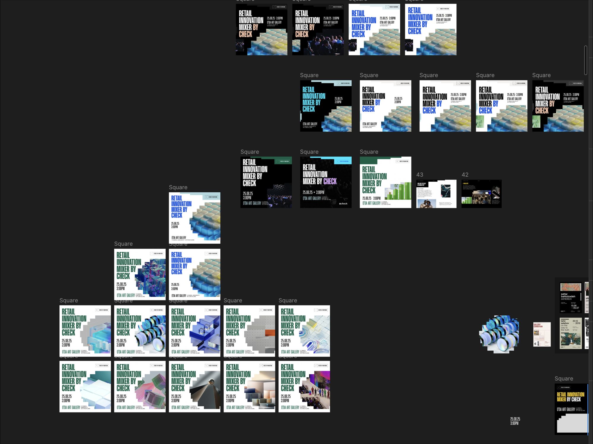
We started where we usually do, with a moodboard. This time most of the references were printed things: carrier bags, posters, catalogues and signage, with bold blocks of colour and chunky type. The first invite ideas came straight out of it, green posters with stepped blocks of colour around the edges.
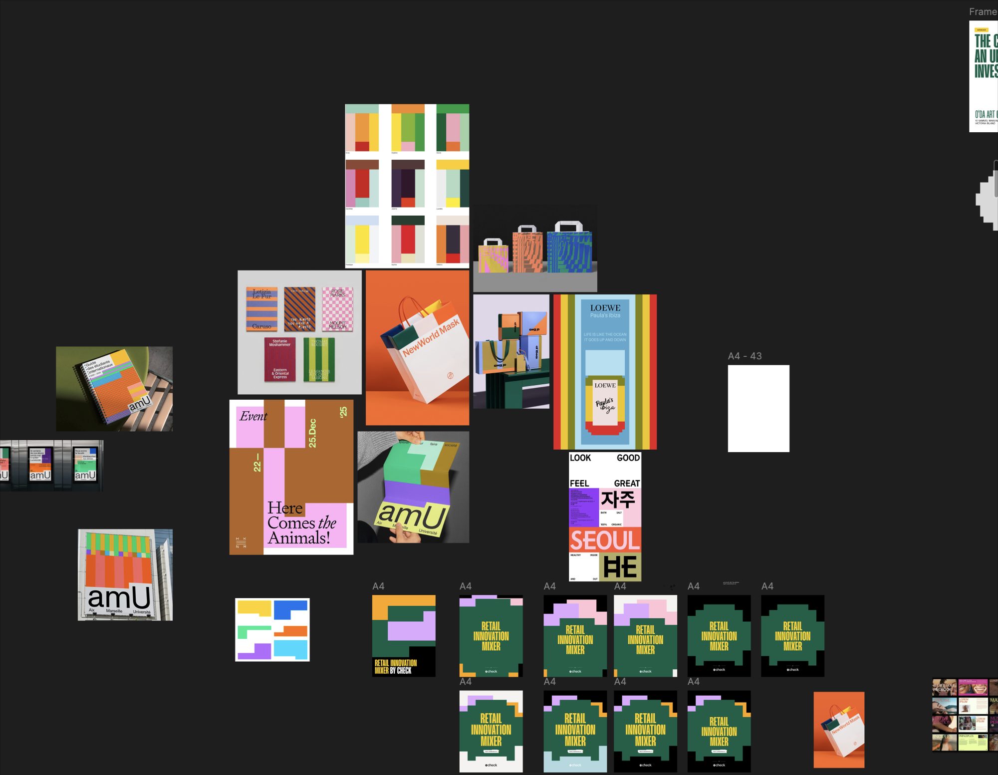
The first full round followed that energy. Tall condensed headlines in blue, green and yellow sat over photos of flower fields and mountains, cut out with a stepped, almost pixelated edge. I liked where it was going.
Back to Check
It didn't make it through review. The feedback was that it didn't look like Check, so we went back to the Check brochure and started again. Charles framed the direction in a way we could test every piece against: the photography carries the future, the layout keeps it corporate, and colour brings the energy. Once each layer had one job, it got much easier to see what wasn't working.
One thing from the first round stayed. That stepped edge ended up framing almost every photo in the final system, and you'll see it on nearly everything below.
The briefing packs
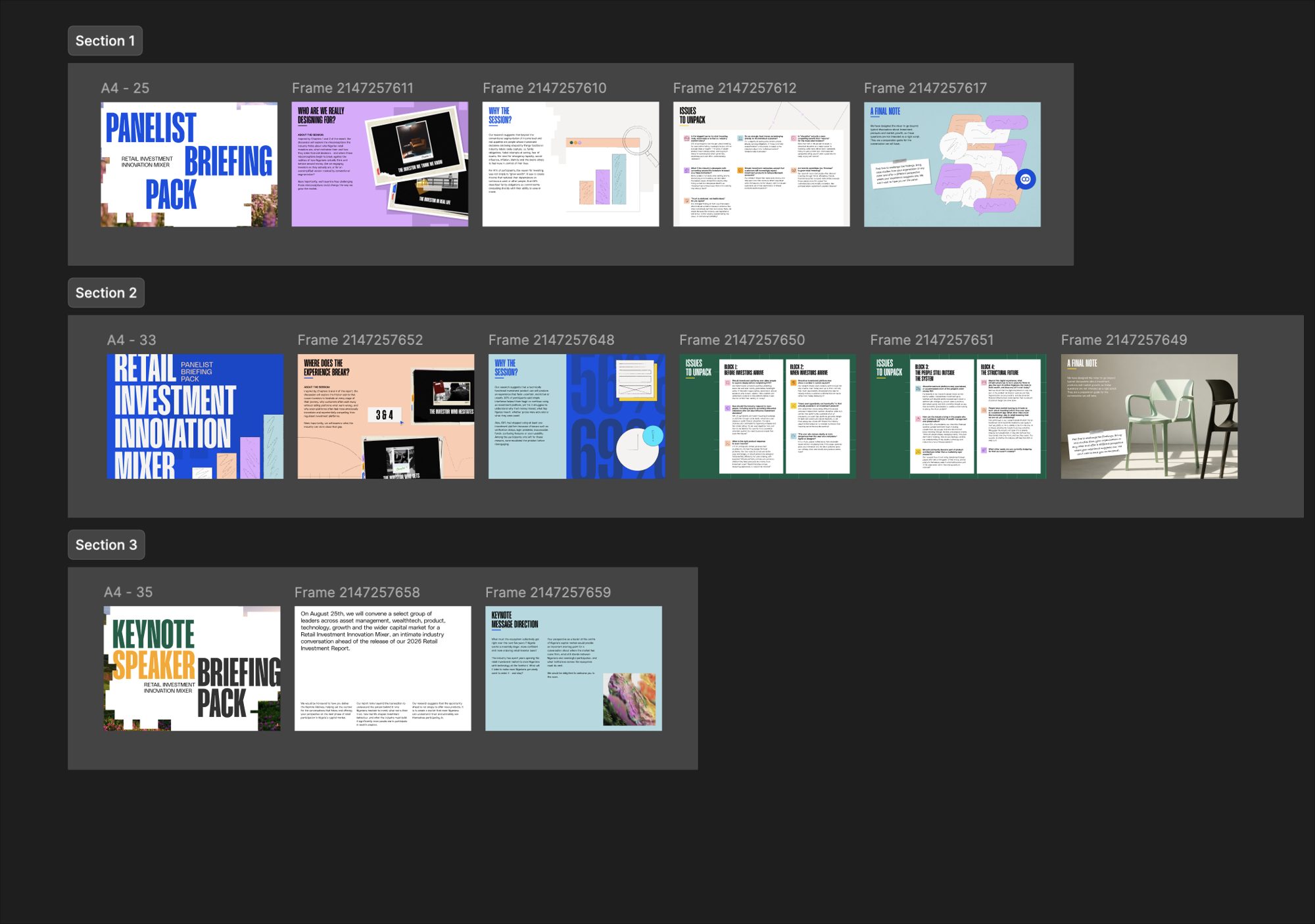
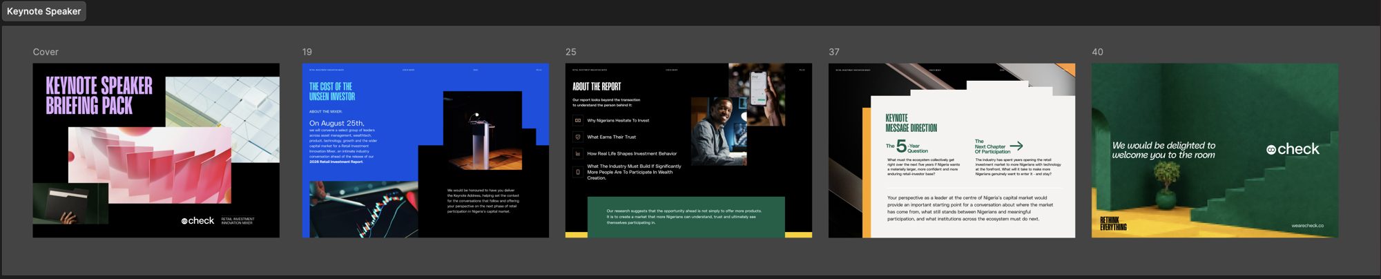
The briefing packs taught me the most. They went to the keynote speaker and each panel ahead of the event, with the session questions and the run of show. We explored a lot of directions on them and went through a lot of chair photos.
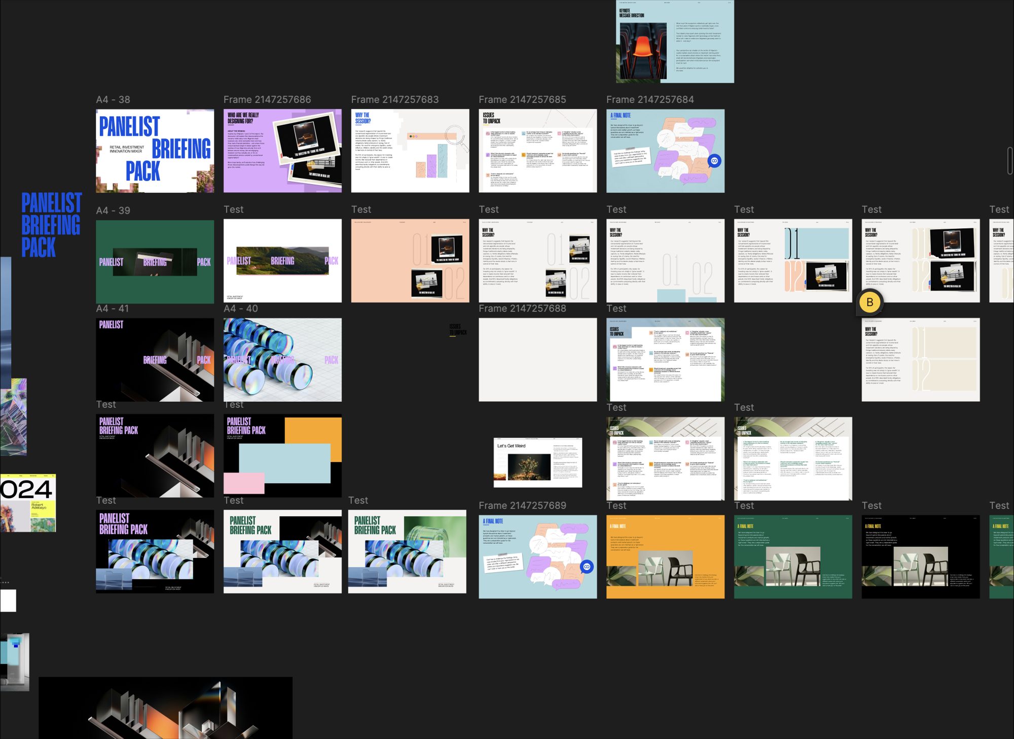
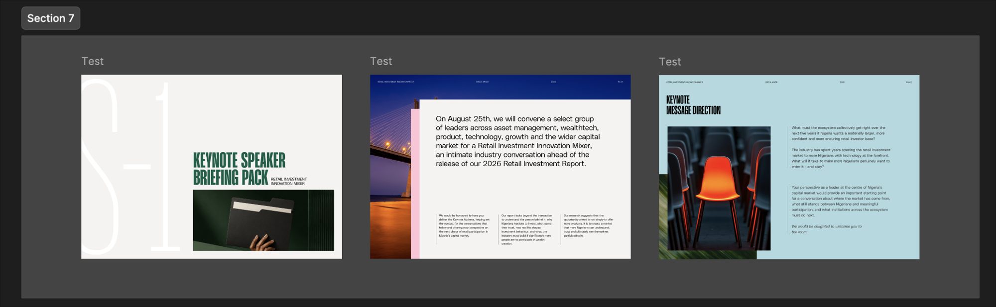
The early versions had strong covers and loose insides. One question from review changed how we approached them: what is she meant to focus on when she picks this up?
We rebuilt the spreads around the questions. Each one leads in bold with a small icon, with a few lines of research underneath, so a panelist can see the question and the reason behind it at a glance. Session 1 got there first, and the other packs followed its layout.


The invite
The invite went through its own long list of rounds. We kept the headline and layout fixed and changed the image underneath until one felt right.
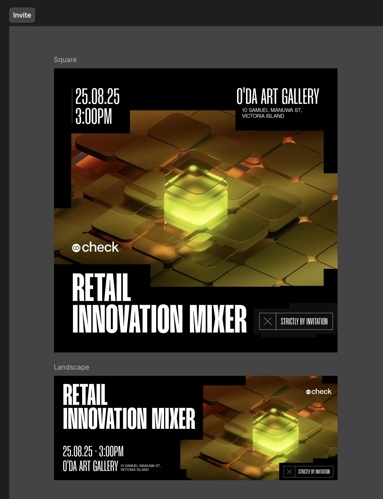
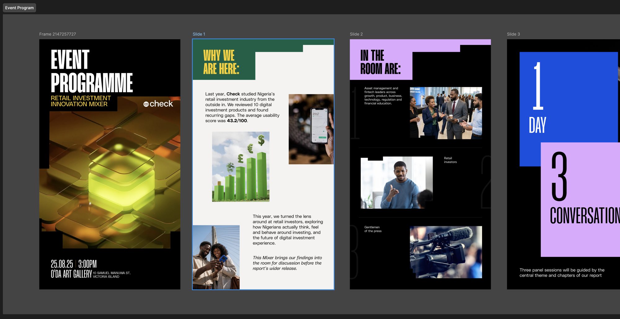
The final one is a glowing green cube on dark tiles. Many of our guests were senior people who'd open it on a phone, so the date and venue sit right at the top, big enough to read at a glance.
In the room
The media walls beside the stage went the same way. Same frame, same headline, five image studies: a glass head, a gold figure, a glowing orange head, a wireframe, and a figure behind ribbed glass.
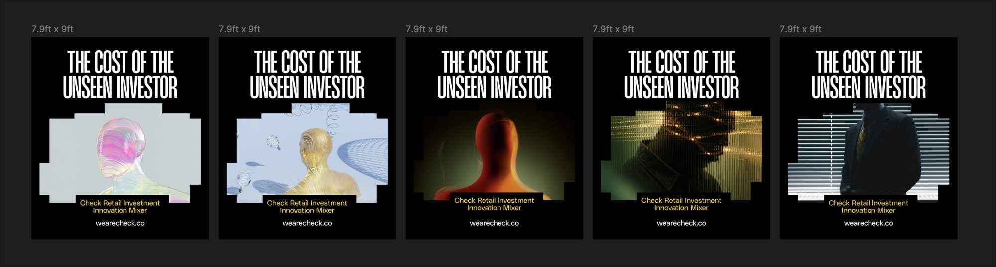
None of them felt like the report. In the end we brought in the halftone photography from the redesigned report cover, the image at the top of this post. That made the room look like the report people had come for. If I did this again, I'd start there.
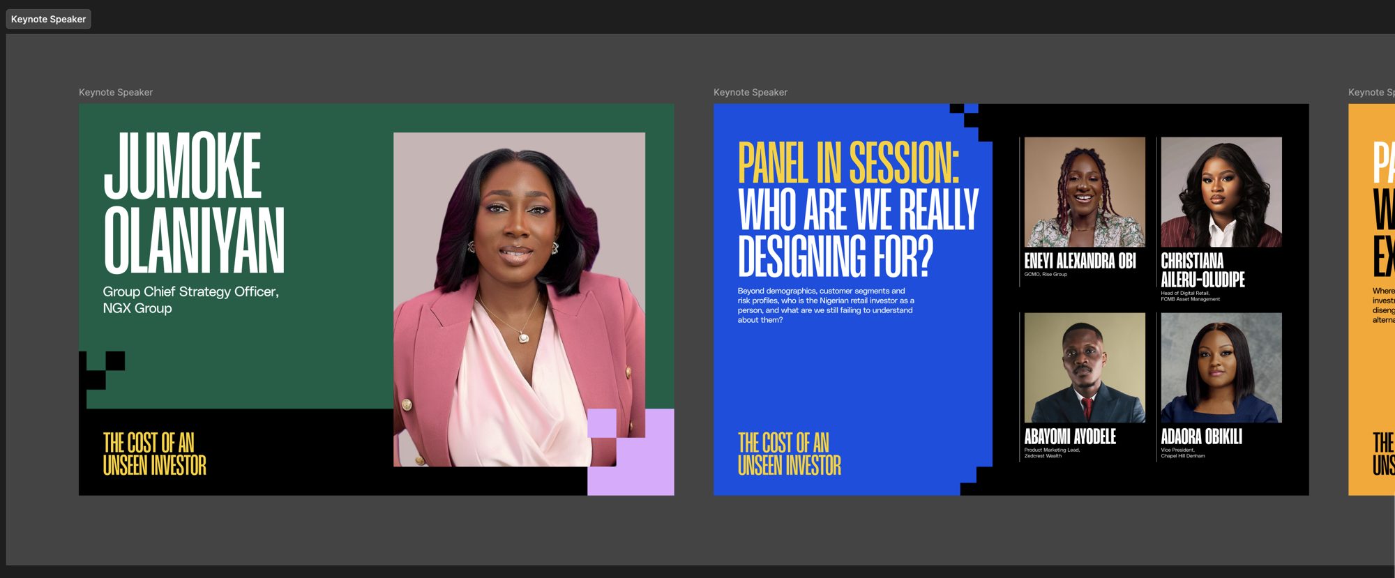
On the main screen, that image carried the theme between sessions. When the keynote and each panel started, it switched to a title card with the speakers and the question for that session.
The programme lived on phones, so we built it as a set of tall slides. It opens on why we were there and who was in the room, then lays out the evening: one day, three conversations.
The photo backdrop
The photo backdrop was planned around the gallery itself. The wall it sits on has a door in the middle, so we designed it as three panels: one on each side of the door and one on the gallery's sign wall. From across the room they read as one.
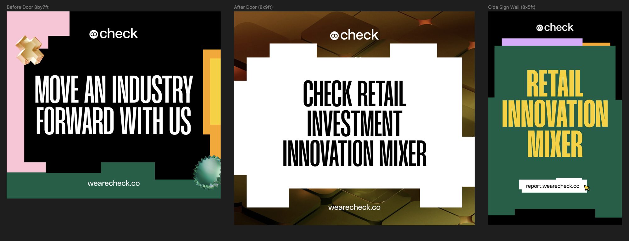
I came into this as the motion person on the team, used to thinking in frames and seconds. Almost nothing here moved. The check I run on every motion system still applied, though: each piece should look like it belongs with the others.
On Instagram
Check shared more from the report and the evening on Instagram:
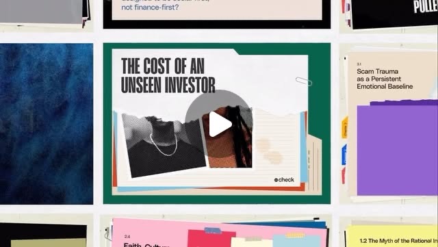 Introducing the report: ten digital investment products, taken apart
 The Cost of an Unseen Investor: design files
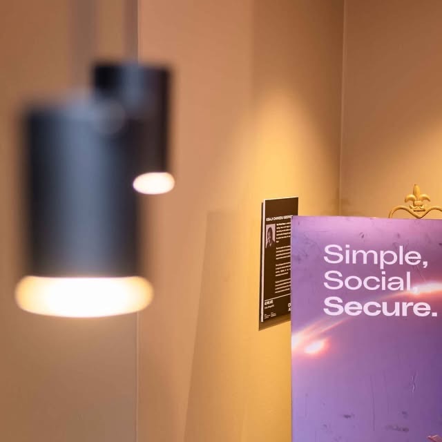 Inside the Mixer: the evening with industry leaders
Designed with Charles Eke, Boluwatife Babatunde, Joshua Oyedepo and Fawas Adeniran.